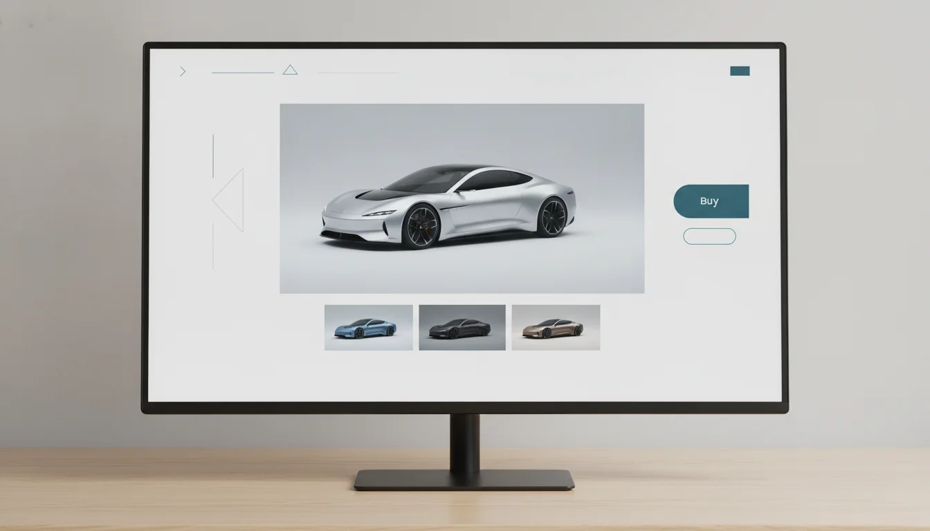












Buyers do not choose cars in isolation; they choose between cars. The comparison is the actual decision surface, whether your product supports it or forces customers to run it across seven browser tabs. Pages that host the comparison honestly collect the decision, and the traffic that goes with settling one, which is why comparison content ranks so well and converts even better when built properly.
Alignment is the whole game
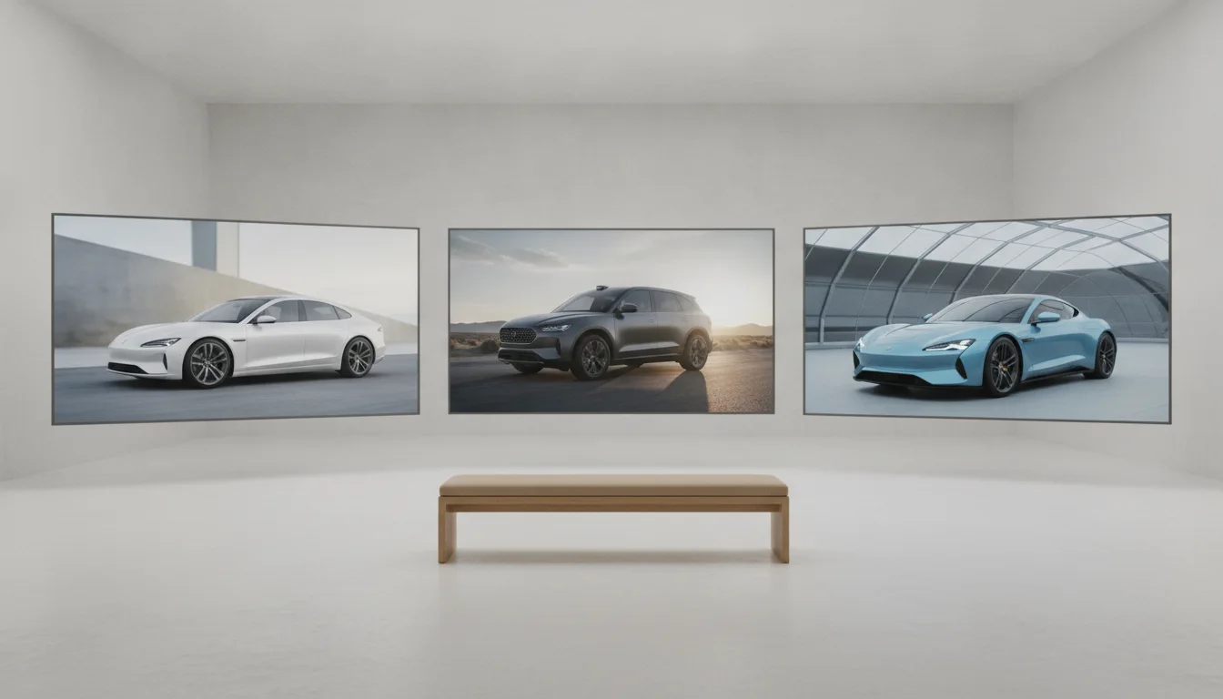
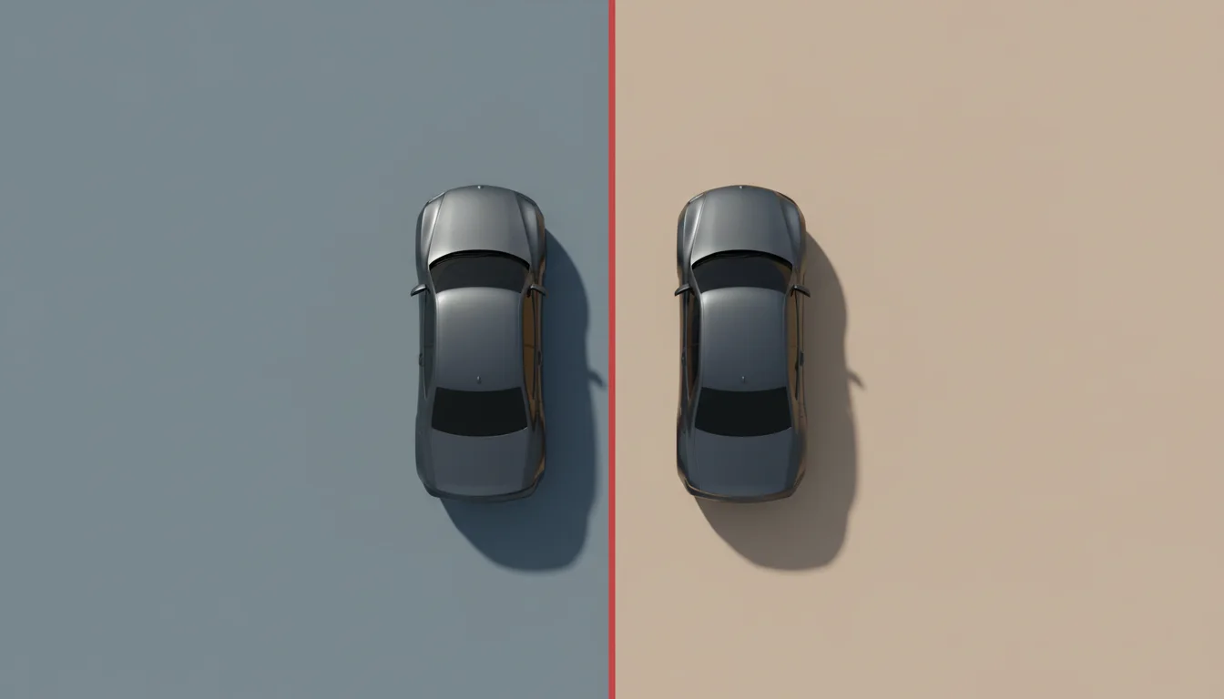
A comparison works when differences between cars are visible and differences between presentations are not. That single sentence condemns most existing pages, where one contender wears a press photo, another a dealer snapshot, and the reader's eye spends its energy reconciling lighting instead of judging proportions. Identical framing, identical angles, identical backgrounds: once presentation is neutralised, the vehicles themselves finally get to disagree.

- Same angle set for every contender, starting with profile views
- Same background and shadow treatment across the row
- Same image sizing, so no car is accidentally the hero
- Colour matched deliberately: like colours, or clearly intentional contrast
The spec table earns its images
Numbers persuade when they attach to things the reader can see. Boot capacity beside the rear three quarter view, cabin technology beside the interior shot, dimensions beside aligned profiles: the layout should let the eye travel between figure and picture without scrolling. Rendering makes this cheap, because every contender carries every angle, including the models nobody photographs side by side in the real world.
Honesty compounds, hedging leaks
Comparison pages fail commercially when they refuse to compare. Readers arrive with one question, which one should I get, and pages that answer both are fine leave the decision unsettled and the reader gone. The pages that build durable traffic pick criteria, declare winners per criterion, and let the verdict follow the evidence. Publishers hesitate here more than platforms do, and the hesitation is the opportunity.
Comparison as a platform feature
Marketplaces and dealer groups sit on comparison gold they rarely mine: the shortlist. Two or three vehicles a shopper has saved, rendered side by side in identical framing with their real prices and availability, is the highest intent page most platforms never build. The imagery requirement, consistent angles across arbitrary inventory, used to make it impractical. It does not anymore.
A shopper comparing two of your listings is minutes from a decision. Give the comparison a home or watch it happen on someone else's page.
For the media version of this playbook, the automotive media page covers comparison content at editorial scale, and the angle guide explains which views make alignment work hardest.
Where to start on Monday
Pick the comparison your sales team hears most often, build one page that follows the alignment rules above, and give it a verdict with reasons. Measure time on page and the click through to the winner's listing against your existing content. One honest page tends to settle the internal debate faster than any strategy deck, and the template it produces scales to the rest of the catalogue at the speed of a data export.