











Ask the global market what colour a car should be and the answer has been boringly stable for a decade: white first, then black, grey and silver, with the entire chromatic rainbow sharing the remaining quarter. Ask buyers browsing listings and a more interesting picture emerges, because colour behaves differently as a purchase than as a statistic. For anyone running listings, configurators or campaigns, both halves of that story matter.
The distribution, roughly
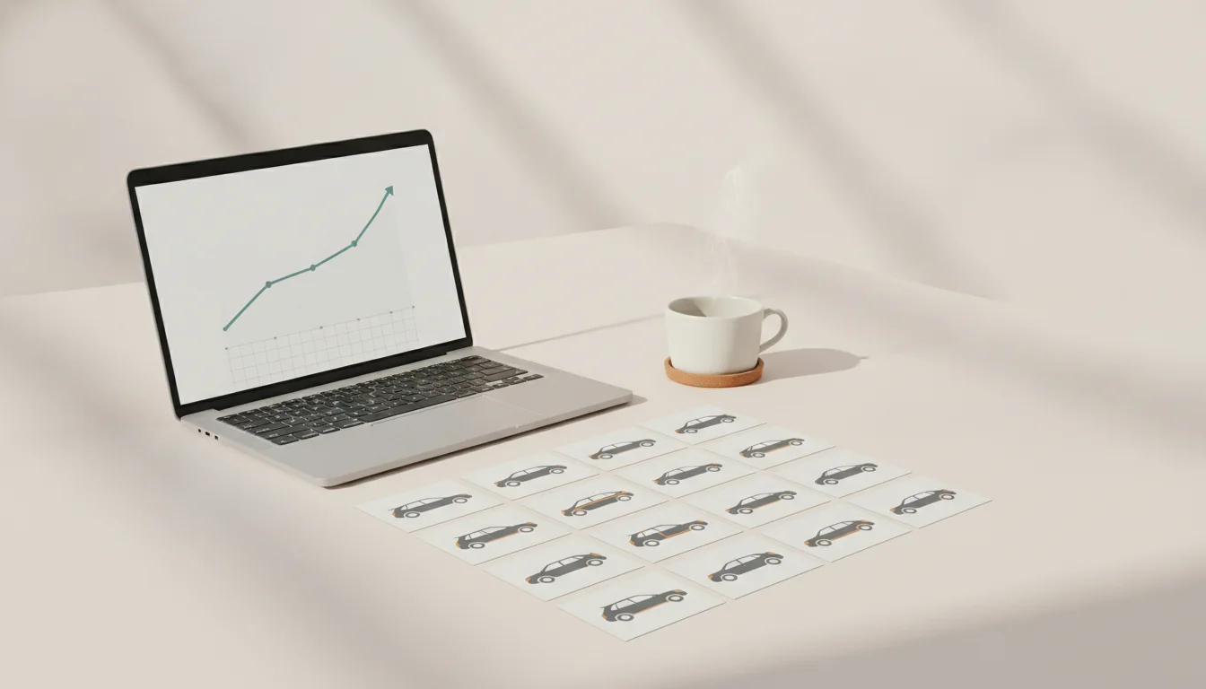
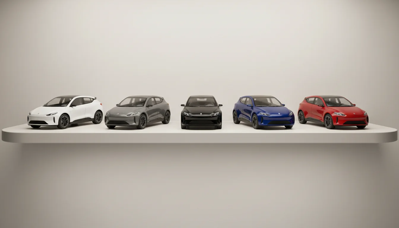
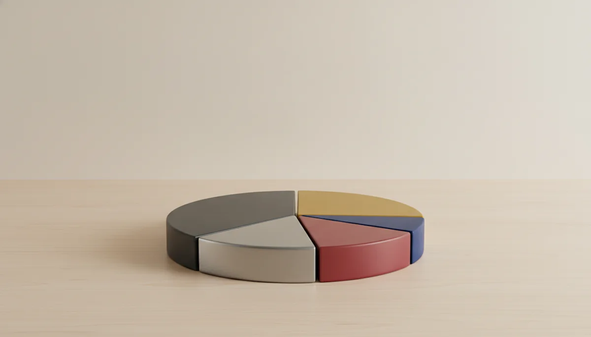
Achromatic colours, white, black, grey and silver, account for around three quarters of new car sales worldwide, with white alone often above a third. Blue leads the chromatic pack, red follows, and everything else, greens, browns, yellows, oranges, splits single digit territory. Regional taste shifts the ratios, model segments shift them harder, and EVs have nudged greys and blues upward, but the shape of the curve survives everywhere.
Why listings feel more colourful than the road
Colour interacts with attention. A red car in a grid of silver ones collects clicks beyond its market share, sporty segments wear colour as identity, and used buyers treat rare colours as either a discount or a prize depending on the car underneath. The practical consequence: chromatic listings punch above their statistical weight in engagement, while achromatic listings win on resale predictability. Neither fact should decide your photography, but both should decide your presentation.
Presenting colour honestly at scale
- Show the actual colour of the actual car, never a lookalike shade
- Name colours the way the manufacturer does, because buyers search those names
- Let configurators repaint the real trim live rather than showing chips beside a silver photo
- Keep lighting consistent across the catalogue, so colours compare truthfully
That last point is where mixed photo sources quietly fail: the same blue reads differently under showroom fluorescents, overcast skies and sunset, and buyers cannot tell paint from weather. Rendered imagery holds lighting constant, which is why factory accurate colour across a range is a data feature rather than a photography achievement.
The long tail is a merchandising tool
Every model's colour list contains shades almost nobody orders, and they are marketing gold precisely because of it. Campaign visuals in an unexpected factory colour stop the scroll while remaining honest, hero placements can rotate colours seasonally without a shoot, and a configurator that shows all fourteen real options feels generous where a three colour press kit feels rationed. With colour as a request parameter, the entire palette costs the same as white.
The market buys white. Attention buys red. Good platforms serve both without lying about either.
If you take one action from this piece: audit ten listings and check whether the pictured colour matches the specified one. The miss rate surprises most teams, and every miss is a small withdrawal from the trust the rest of the listing is trying to earn.
For campaign planners there is a seasonal footnote worth keeping: colour attention shifts with the calendar, brighter shades pull harder in spring creative, deeper tones in autumn, and the rendered palette lets campaigns follow that rhythm without a single reshoot, which is a quiet budget line nobody misses until it is gone.