











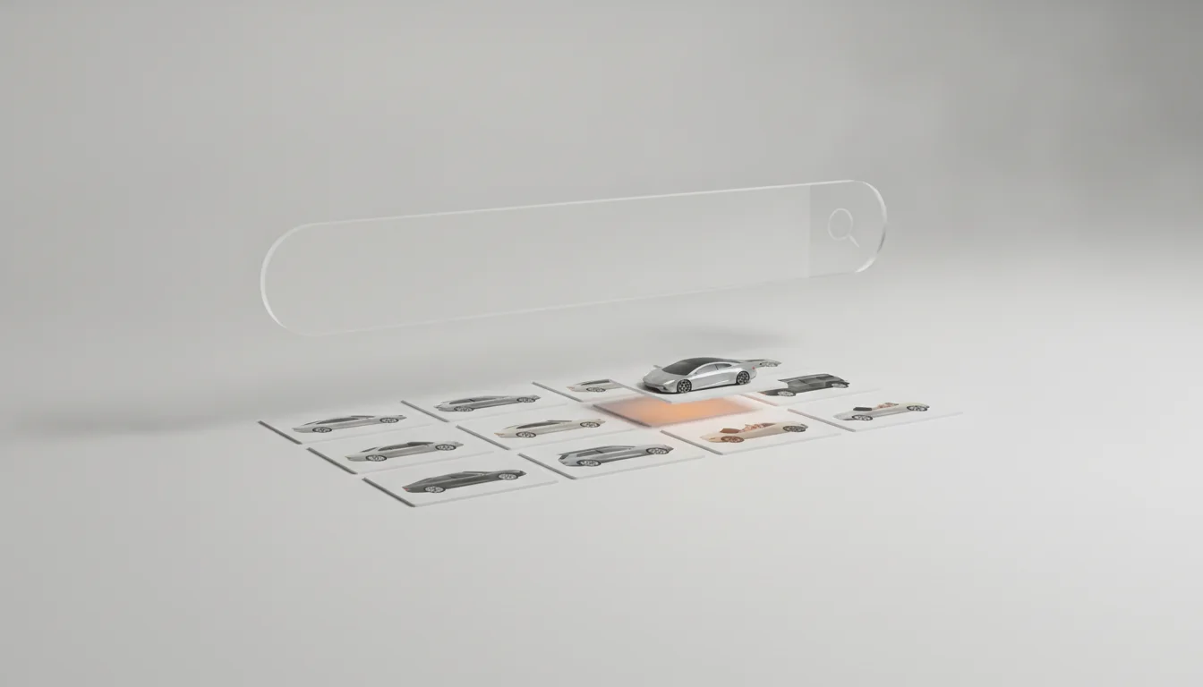
Vehicle search is judged in the first three hundred milliseconds and remembered by its images. A results grid that pops in complete feels like a catalogue; one that assembles itself in stutters feels like a scraper. The difference is rarely the search engine and almost always the image layer strapped to it, so this piece covers search specifically through that lens.
Autocomplete with faces
Suggestions with thumbnails convert measurably better than text lists, because recognition outruns reading. The pattern: as the query narrows to models, each suggestion carries a small front three quarter render, served at exactly thumbnail size. The images come from predictable parameterised URLs, so the suggestion payload is a handful of strings, and a short prefetch on focus makes the first keystrokes feel psychic. Search resolution handles the fuzzy matching underneath.
The results grid under pressure
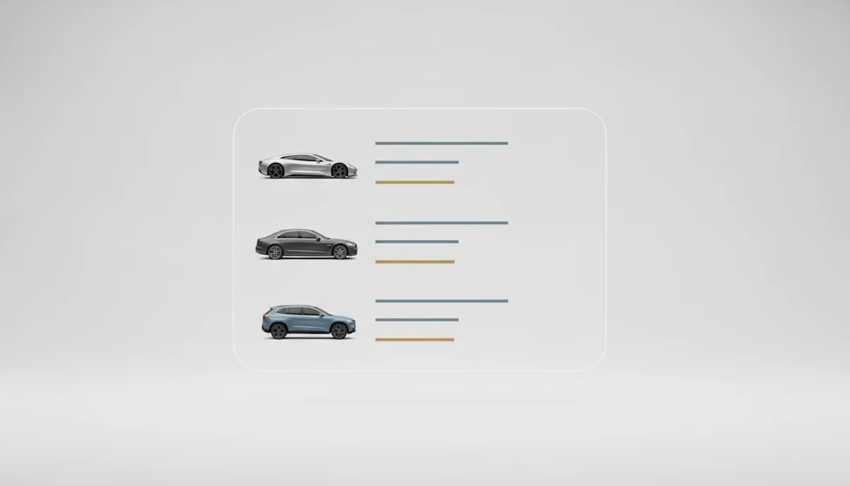
- Fixed aspect ratio cells, reserved before any image arrives
- Thumbnail sized WebP, never detail page assets shrunk by CSS
- Lazy loading below the fold, eager above it
- Stable URLs per vehicle, so pagination and back navigation hit warm caches
Filters add the twist search engineers underestimate: every facet change reshuffles the grid, and naive implementations re fetch images the session already held. Keying cards on stable vehicle IDs lets the browser cache absorb reshuffles, which is why filtered browsing on a well built grid feels instant from the second interaction on.
The colour facet, done honestly
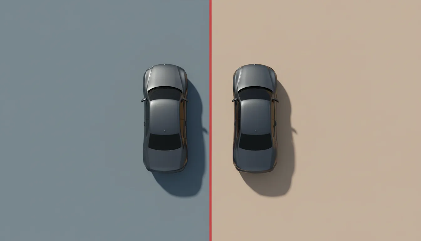
Colour filtering is where vehicle search can quietly delight: filter by red, and the grid shows the actual models repainted red rather than whatever colour the stock photo wore. With colour as a render parameter, the facet and the imagery agree by construction, and the search result becomes a small configurator without anyone building one.
Empty states and long tails
Search surfaces the catalogue's edges: the rare trim, the discontinued model, the query that matches one vehicle in the country. These are precisely the results photography never covered, and rendered coverage keeps the grid uniform to its last row. The empty state itself deserves an image too; a branded placeholder with a suggestion path outperforms a shrugging illustration, because search abandonment concentrates exactly here.
Users forgive a search that finds nothing. They do not forgive one that looks broken while finding it.
Measure the whole loop as one metric: keystroke to complete painted grid, on a mid range phone, over cellular. The benchmark guide supplies the method, and the caching strategy supplies most of the improvement.
Saved searches close the loop
The search grid's imagery discipline pays a second time in retention surfaces: saved searches and alerts reuse the same thumbnails in emails and notifications, and the consistency between the alert card and the grid it links to makes the return visit feel seamless. One image system, keyed on stable IDs, quietly powers the whole loop from first keystroke to the push notification that brings the buyer back.