











Email is where image best practices go to be humbled. The renderer is a fragmented museum of engines, dark mode rewrites your colours without asking, images load late or never, and the one message that matters most, the offer with the customer's car in it, is exactly where the medium fights hardest. Automotive senders live with this more than most, because their emails are image led by nature. Here is what reliably survives.
The rules the inbox enforces
- Absolute image URLs from a fast CDN, because email loads nothing locally
- Explicit width and height attributes, so blocked images hold their layout
- Alt text written to sell, because a description may be all that renders
- Realistic total weight, since heavy messages clip and clipped messages hide your call to action
None of this is automotive specific, and all of it hits vehicle emails harder, because a broken hero image in a renewal offer is not a cosmetic bug. It is the offer failing to exist.
Dark mode and the transparent cutout
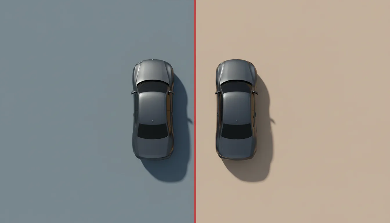
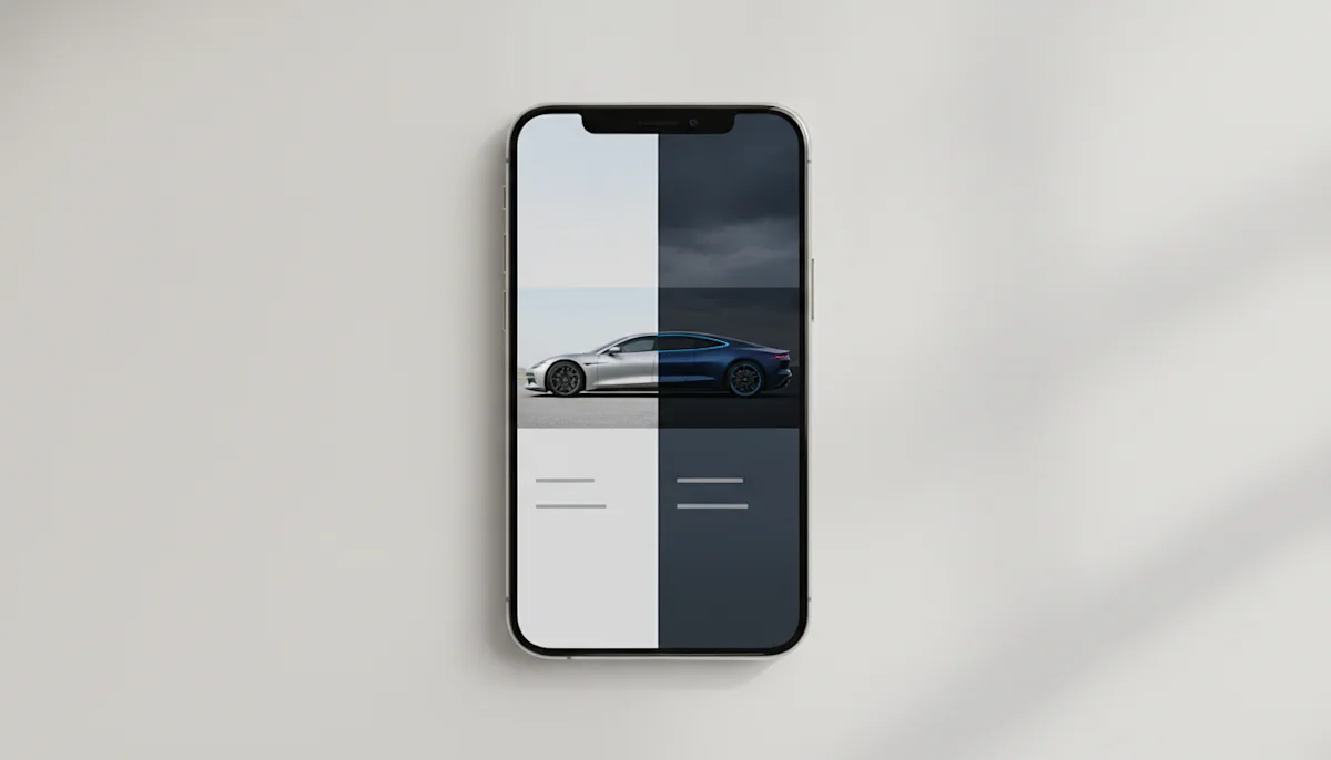
Dark mode is where vehicle emails visibly break: baked white backgrounds glow like light boxes in a dark inbox. The robust answer is the transparent cutout over a background colour the template controls, so the client's theme inversion changes the field behind the car rather than fighting a baked in studio white. Test the dark grey car on the dark background case specifically, and keep a subtle shadow variant ready for grounding on light themes.
Personalisation with the actual car
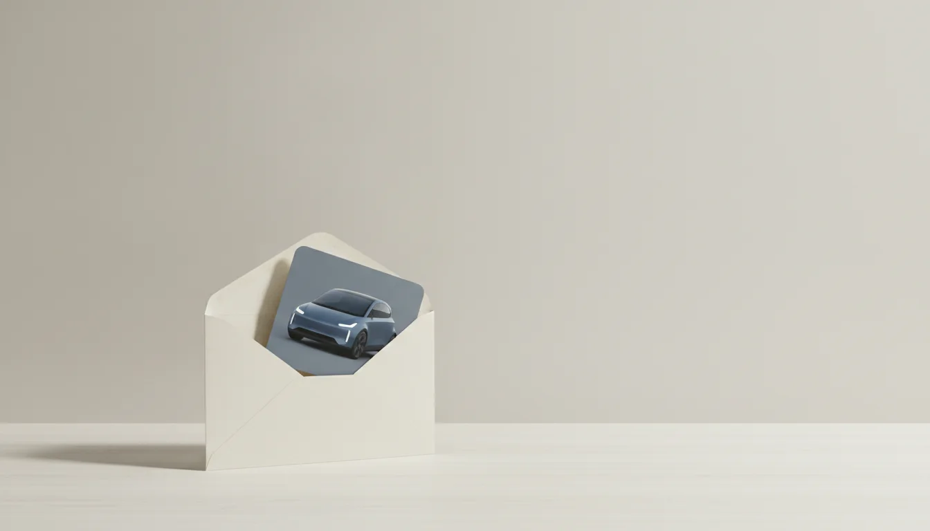
The email that outperforms in automotive is stubbornly consistent across use cases: the one showing the recipient's vehicle. The renewal with the insured car, the service reminder with the owned car, the offer with the configured car. Resolving by VIN or plate at send time makes this a merge field rather than a project, and the image URL with its parameters slots into any ESP template that accepts dynamic values.
Weight, size and the two image budget
Inbox economics reward restraint. A hero vehicle image and at most one supporting visual carry a message further than a gallery ever does in email, because every added image raises clipping risk and load time on cellular. Request the rendered width, use JPEG or WebP depending on client support strategy, and let the landing page do gallery duty. The email's job is one clean image, one clear message and one obvious button.
In email, the second image competes with your call to action. Make it earn the seat.
Send tests to real clients before every campaign that matters: the big webmail providers, one corporate desktop client, dark and light. Twenty minutes of ritual catches what no checklist predicts. The backgrounds guide has the template recipes that make the transparent approach concrete.
Deliverability's quiet image tax
Image handling also touches whether the message arrives at all. Senders with heavy, slow or broken image sets accumulate the engagement signals filters dislike: short opens, quick deletes, complaints from clipped messages whose unsubscribe link vanished. Clean, light, working imagery is not just presentation; it is part of the sender reputation you spend every campaign. The two image budget pays twice.