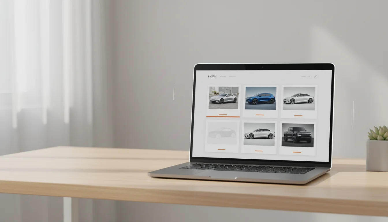












Accessibility guidance rarely mentions cars, yet vehicle platforms are image galleries with prices attached, which makes them exactly the sites where image accessibility decides whether someone can shop at all. The rules are not exotic. They are the standard ones, applied with automotive specifics, and most of them improve the experience for every user squinting at a phone in sunlight.
Alt text that carries the listing
For a screen reader user, the alt text is the vehicle image. The automotive pattern writes itself from data you hold: year, make, model, trim, colour, angle, and nothing else. Decorative repetitions of the same vehicle across a gallery can be marked as such rather than read eight times, and the condition photos on used listings deserve alts that say what they document, scuff on rear left wheel arch, because that is the information a sighted buyer extracts.

- Generate alts from the vehicle record, never from filenames
- One full description per vehicle per view, not per pixel variant
- Condition photos described by what they show, honestly
- Empty alt only for genuinely decorative repetition
Contrast beyond the text checker
Contrast rules cover interfaces, and vehicle imagery creates its own cases: a dark grey car on a dark theme background disappears for low vision users exactly as it does in a dim garage. Consistent studio treatments make this manageable, because the background is a controlled value; a shadow or grounding variant separates dark cars from dark fields, and the transparent cutout over a deliberately chosen surface beats a baked background that fights every theme.
Motion, zoom and control
Galleries and configurators love motion, and vestibular disorders do not. Honour the reduced motion preference by swapping crossfades and auto rotations for instant changes; the information is the image, not the transition. Allow pinch zoom everywhere, because examining a wheel or a dashboard detail is core shopping behaviour, and blocked zoom is a silent lockout. And keep every gallery control reachable by keyboard, with the angle names as accessible labels, front three quarter view, not button four.
Why consistency is an accessibility feature
Uniform framing across a catalogue means a user who has understood one listing has understood them all: the same angle order, the same positions, the same interactions. Cognitive load drops for everyone and dramatically for users relying on assistive tech, where every layout surprise costs real effort. The catalogue that looks calm is also the one that navigates calmly.
An inaccessible gallery is not a compliance gap. It is a shop with the door locked for some customers.
Fold the checks into the build: automated alt presence, contrast linting on themed surfaces, and one manual screen reader pass per template per quarter. The image SEO guide overlaps heavily here, because search engines and screen readers read the same signals, and both reward the site that describes itself honestly.
The business case, stated plainly
Accessibility work on vehicle imagery pays beyond compliance. The same structured alts feed search engines, the same contrast discipline survives sunlight on a forecourt phone, and the same keyboard paths make power users faster. Platforms serving fleet and corporate buyers should note that procurement increasingly asks for accessibility conformance in writing, and image handling is among the first things auditors actually test.